Field
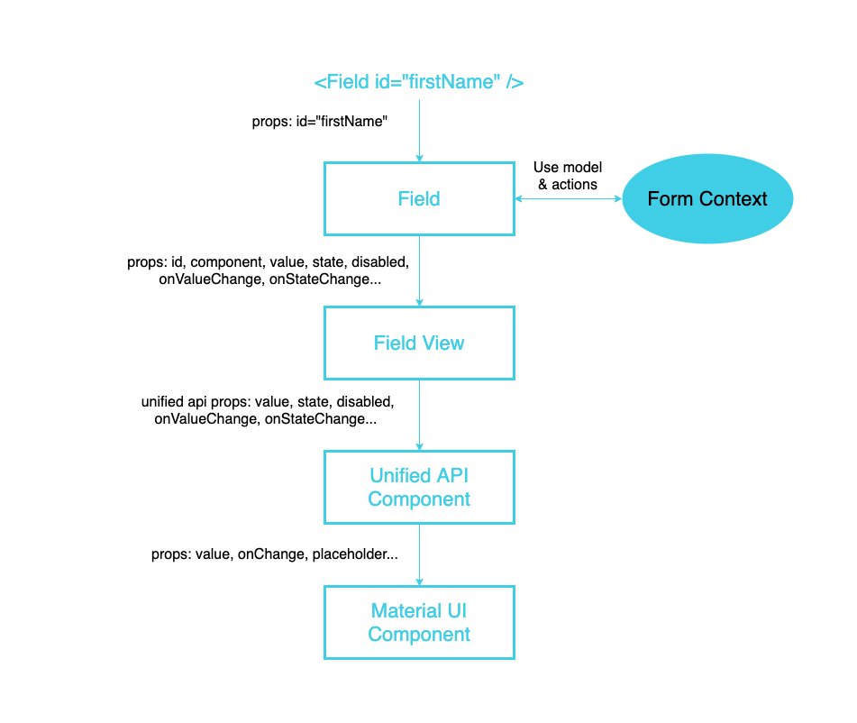
Field component is a specific child component that uses the Form's context to get data from the form and change the form data.
Field Component
@cofi/react-form/Field serves as a default field component. Its the result of createField(SomeFieldView) HOC (that pass the underline field view component all the data that the field view needs to render) and a default FieldView component:
import createField from './createField';
import FieldView from './FieldView';

export default createField(FieldView);
Props
| Name | Type | Description |
|---|---|---|
| id | required string | Field id as represented in the json of model.fields object keys |
Note: Field component propagates every property to the component it wraps, except for cofi-reserved properties, that appear in Field View. However, specifying the property outside of Cofi's context also means it is not part of the lifeycycle of Cofi any more. Therefore, we strongly recommend to use Cofi Form configuration
field.component.stateobject to pass data for each underline component.
Usage Example
import { Form, Field } from '@cofi/react-form';
import SomeInputText from './my-components/Text.jsx';

const model = {
  id: 'user-form',
  fields: {
    firstName: {
      path: 'firstName',
      label: 'First Name',
      component: {
        name: 'InputText',
      },
    },
    lastName: {
      path: 'lastName',
      label: 'Last Name',
      component: {
        name: 'InputText',
      },
    }
  }
};

const resources = {
  components: {
    InputText: : { renderer: SomeInputText },
  }
};

<Form model={model} resources={resources}>
  <h2>User Details</h2>
  <Field id="firstName" />
  <Field id="lastName" />
</Form>
Structure

createField(FieldView) HOC
A function that gets a FieldView component as a parameter and returns a new wrapped component, which receives data from the closest Form Provider's context using the id prop, and populates props for the FormView from its form's context.model.fields[id].
Field View
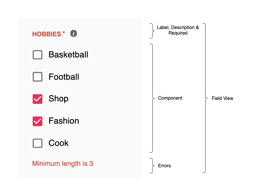
Renders the specified component (for instance, inputText, checkboxList, etc) and some data like label, description and errors. Cofi provides a default FieldView but
any app can design its own field view and use it like const Field = createField(MyCustomFieldView);
Note
The fields in model.fields represent the form. Each field defines a settings that will affect its lifecycle. If you choose NOT to include a specific field in the render function - the field's lifecycle is still evaluated (meaning that excludeTerm, validations and disableTerm are evaluated nonetheless).
Keep in mind that all fields are evaluated even without being rendered.
Props
| Name | Type | Description |
|---|---|---|
| id | required string | Field id |
| label | string | Field label |
| description | string | Field info |
| component | function / class | function. React ui component which manipulates the field value. Component should get a set of predefined props as described in Unified api components |
| value | any | Value of the field, supplied from the model.data |
| state | object | Represents the ui state of the field's component |
| excluded | boolean | Is the field excluded? (and not rendered) |
| disabled | boolean | Is the field disabled? |
| dirty | boolean | Is the field value not equals to its initial value? |
| required | boolean | Is the field required to have a valid value? |
| empty | boolean | Is the field value considered empty? (according to isEmpty function) |
| invalid | boolean | Is the field invalid? (if a field is required and empty - and have required error, its not considered invalid in terms of UX |
| errors | object array | Current field errors - array of { name, message } |
| styleOverrides | string | Style to override field's default view |
| onValueChange | function | Callback to pass new value for the field |
| onStateChange | function | Callback to pass new component state for the field |
Default Field View
For the following form definition:
import CheckboxCollection from '@cofi/react-components/edit/CheckboxCollection';

const form = {
  id: 'user-form',
  fields: {
    hobbies: {
      label: 'Hobbies',
      path: 'hobbies',
      description: 'Select at least 3 hobbies',
      component: {
        name: 'CheckboxCollection',
        state: {
          items: [
            { label: 'Basketball', value: 'BASKETBALL'},
            { label: 'Football', value: 'FOOTBALL'},
            { label: 'Shop', value: 'SHOP'},
            { label: 'Fashion', value: 'FASHION'},
            { label: 'Cook', value: 'COOK'},
          ]
        },
      },
      required: true,
      validators: [{
        name: 'minLength',
        args: {
          value: 3,
        }
      }]
    },
  },
  data: {
    hobbies: ['SHOP', 'FASHION'],
  }
};

const resources = {
  components: {
    CheckboxCollection: { renderer: CheckboxCollection },
  }
}
Default FieldView will render:

Override Default Field View Style
Override default FieldView style using styleOverrides prop.
Example
import { Field } from '@cofi/react-form';

const styleOverrides = `
  width: 400px;
  margin: 0;

  [aria-label="Label"], [aria-label="Required"], [aria-label="Error"] {
    color: orange;
  }
`;

const StyledField = (props) => (<Field styleOverrides={styleOverrides} { ...props } />);


<StyledField id="firstName">
<StyledField id="lastName">
Custom Field View
Defined a custom FieldView component in order to change the field's view.
Example
// CustomFieldView.jsx
import React from 'react';
import noop from 'lodash/noop';
import styled from 'styled-components';

const Field = styled.div`
  margin-bottom: 40px;
`;

export default ({
  id = undefined,
  label = undefined,
  description = undefined,
  value = undefined,
  excluded = false,
  disabled = false,
  dirty = false,
  required = false,
  empty = false,
  invalid = false,
  errors = [],
  state = {},
  component = noop,
  onValueChange = noop,
  onStateChange = noop,
  ...customProps
}) => {
  if (excluded) return null;

  const Component = component;

  return (
    <Field id={id} className="field">
      {
        label && <div className="field-label"><span>🌴</span>{label}</div>
      }
      {
        Component && <div className="field-component">
          <Component
            {...customProps}
            value={value}
            state={state}
            disabled={disabled}
            dirty={dirty}
            required={required}
            empty={empty}
            invalid={invalid}
            onValueChange={onValueChange}
            onStateChange={onStateChange} />
        </div>
      }
      {
        description && <div className="field-description"><span>☝</span>{description}</div>
      }
      {
        errors.map(error => (<div key={error.name} className="field-error">
          <span>😡</span>{error.message}</div>))
      }
    </Field>
  );
};
// Demo.jsx
import { Form, createField } from '@cofi/react-form';
import { model, resource } from './form';
import CustomFieldView from './CustomFieldView';

// create field with custom view
const Field = createField(CustomFieldView);

<Form model={model} resources={resources}>
  <Field id="name" />
  <Field id="hobbies" />
</Form>
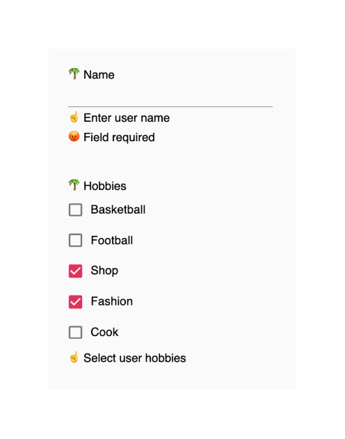
Result

You have more detailed example in our form demos
